Search This Blog

Showing posts with label Animation. Show all posts

Thursday, September 18, 2014

Thursday, April 24, 2014

Reference and Visual Memory 1


Maurice Noble had a unique way of using reference. Rather than drawing directly from source material for a particular design, Maurice would pull inspiration from what he called his "Visual Memory." This "Visual Memory" was a store of visual images in his brain that he had built over time through travel, viewing art, and other experiences that would make an impression on him.  Later... sometimes years or decades later... he would redraw his impression of a place from memory for a design... using its strongest characteristics. 

Here are a few Maurice design examples, and their original inspiration:
"Claws For Alarm" and Mark Twain.

It is well known that Chuck Jones was a huge fan of American author Mark Twain. What is less known is that Mr. Twain found his way into a number of Chuck's cartoons. Here Maurice gives us a "poor man's" version of the grand hall from Twain's 19 room Connecticut mansion in "Claws For Alarm." (1954) 


"Deduce You Say" and the Tam O'Shanter.

Maurice often drew design inspiration from life experience. His assignment for "Deduce You Say" (1956) was designing old world London. But since he had never been to Europe, he referenced the second best thing... The Tam O'Shanter restaurant on Los Feliz Blvd. Pictured here is Walt Disney's favorite table.


Inspiration from "Lost Horizon." (1937)

Frank Capra's movie "Lost Horizon" was one of Maurice's favorites. From it he drew inspiration for bits of "How The Grinch Stole Christmas," "What's Opera, Doc?" and many other films. This is a great example of Maurice's use of visual memory. He couldn't look at still frames of the movie, but he had seen "Lost Horizon" enough times that certain scenes made a distinct impression on him. Finding their way into his work.


Supplement to pg. 77 of The Noble Approach: Maurice Noble and the Zen of Animation Design.

Thursday, January 9, 2014

Surogat


Maurice never gave much praise to many non-Disney, non-Warner's cartoons. But one of his favorites was the 1961 Oscar winner "Surogat" by Dusan Vukotic. Maurice felt that the film was a great example of what the animated medium is best at; "graphic imagination."  It's not too far of a stretch to see how this film could have helped influence Maurice's own Oscar winning effort, "The Dot and the Line." (1965)

Monday, November 4, 2013

AWN reviews "The Noble Approach."

Fred Patten of "The Animation World Network" gives a lovely review of The Noble Approach.

To read the article please go HERE.

Musician Billy "Keys" Benson enjoying his copy of "The Noble Approach" with friends in Northern California.

Tuesday, October 29, 2013

Color Keys and Color Sketches: Background Drop-off


A Maurice color key sketch (top) with a Phil DeGuard background from "Boyhood Daze." (1957) courtesy of Paul Bussolini

Phil's final backgrounds (as in the above example) were often painted lighter and with less contrast than Maurice's color keys. The reason being that under camera each background carried an average of 5 cel layers on top of it. Each cel layer would darken the background a certain percentage. 

 A background and cel set-up from "Boyhood Daze." (1957) courtesy of Mike Giaimo. 

It is easy to see the striking difference in value and contrast between a "naked" background, and one shrouded in its cel covering. Maurice would test background/ cel setups under camera to make sure all the elements looked correct BEFORE committing to a specific design approach. A pretty background painting meant little if it didn't work under the lens. Only once key shots worked to Maurice's satisfaction would Phil would move forward with the backgrounds on the rest of the film.

Supplement to pg. 146 of The Noble Approach


Thursday, October 24, 2013

Pointers: Literal and Implied Guide Lines

Maurice often used different compositional tools to help guide the focus of the audience to a specific part of a picture plane. Most usually he would try to use background elements to support, and draw attention to a character. 


Here are a few examples of literal and implied guide lines. Literal lines (hi-lighted by solid arrows in these examples) are actual lines that point to a certain area of focus. Implied lines (here illustrated by dashed arrows) are created by elements that line up in the picture plane. The relationship between these elements help create a pointing device that support the position of the character. I've chosen examples where the Coyote is rather small. Movement of the character is key to attracting the eye. But without pointing devices, it would be easy for the character to get lost.


Implied lines are related to Gestalt reification and illusory contours. The basic idea being that the mind perceives an edge or line simply because of the placement and space relationships between objects.

Supplement to pg. 151 of The Noble Approach.


Monday, October 21, 2013

Maurice Pans 005: Beginnings and Endings

A vertical pan from "Much Ado About Nutting." (1953)

Maurice taught, "The eye isn't going to see much detail in the middle of a fast pan. It will see color and pattern in an abstract way. Focus on making the start and finish of the pan work well, the parts that the audience will actually see. Then concentrate on the length and feel of the pan."

From pg 159 of "The Noble Approach."

Tuesday, October 15, 2013

The Thunderbolt - As Retold By Eric Calande

Images: A great deal of the design for "Horton Hears a Who" (1970) was inspired by trips Maurice took to Hawaii. Posted here are some of Maurice's "designed storyboards" for the film.

Apparently while Maurice was at Disney's in the 1930's, he managed a short vacation to see his brother who was attending The University of Hawaii. Aviation was in its infancy and the only practical way to make the trip was by cruise ship. The trip itself took several days and as the ship neared the island Maurice needed to notify his brother of his impending arrival. Maurice went to the on-board telegraph office and began dictating his massage; "I've had the most amazing time on-board the ship. What an amazing experience this has been. The staff has been just incredible and I've meet the most wonderful people. My accommodations have far exceeded my expectations. I could talk about the delicious food for days. I've never eaten so well." etc. etc. Once Maurice finished dictating his message the operator told him his long-winded message was going to cost about $75 to send. So Maurice shortened the message to... "Arriving on next ship - Maurice". 


Upon arrival Maurice was greeted by his brother and while de-boarding the ship, he saw the most lovely native girl. Maurice was awestruck by her beauty. Apparently his eyes met hers, hers his, and in Hawaiian terms, both were "struck by the thunderbolt" (love at first sight). 


The two ended up meeting and spending a lot of their time together. Though the natives were SURE Maurice was going to steal the heart of, and marry one their women, Maurice's vacation came to an end and he returned to the mainland. 

Over time Maurice lost contact with the girl, and years later returned to Hawaii to look for her. Through the locals he learned that the girl's family owned one of the biggest department store chains on the island. Figuring a wealthy, beautiful woman wouldn't want anything to do with a lowly animation artist, he sadly abandoned his quest. For the rest of his life Maurice talked about his regret in not staying and marrying the girl. 

...And that concludes the story of the Thunderbolt. - Eric Calande

Artwork courtesy of Paul Bussolini

Supplement to pg. 70 of The Noble Approach. 

Friday, October 11, 2013

Martian Through Georgia Progression

Above: A Maurice Noble layout and final Phil DeGuard painting from "Martian Through Georgia." (1962) The film was co-directed by Chuck Jones and Maurice.

In his early Warner career, Maurice made numerous color keys to help guide painter Phil DeGuard in the final background paintings. But by 1962 the two artists had been working together so long that Maurice could often give Phil simple shorthand color notes, such as in this background layout, to indicated what he wanted. 

Lettering by Don Foster.

Supplement to Pg. 126 of "The Noble Approach." 

To watch the film, visit the link HERE.

Monday, October 7, 2013

Color and Value: 001

Maurice most usually thought of color in how it related to value. ( The relative lightness or darkness of a color.) Always making sure that a composition worked in black and white FIRST before moving on into something more colorful. 

Cartoon Colour cel vinyl was Maurice's paint of choice. The paints were marked with a one (1) for the lightest value, and the bigger the number, the darker the paint. 


Above is a chart Maurice used to show how the value of many colors he used related to gray. 

GRAY SCALE SHOWING CORRESPONDING COLOR VALUES
The color number appears vertically under each color and #20 represents the darkest value. The gray values on the left are in the same order, from dark to light, and any color number appearing on a horizontal line with a gray value has that same gray value when photographed in black and white. 

How is this useful? It's sometimes difficult to tell how dark or light a color really is. When transferring a black and white sketch Maurice wanted to be sure that his colors were as close as possible to the original sketch values.

Supplement to pg. 91 of "The Noble Approach."

Clean up by Esben Sloth

Friday, September 27, 2013

CTN Expo 2013

Animation expo
November 15th- 17th 2013

We've been invited to this years CTN Expo to have a chat about Maurice and "The Noble Approach." We'll look at Maurice's design process, and discuss a number of interesting things that didn't make it into the book. A book signing will follow the conversation.

To learn more visit:
http://creativetalentnetwork.com

Tuesday, September 24, 2013

Maurice Pans 03

Example from "90 Day Wondering." (1956)

To make a pan more dynamic, Maurice would often use background elements to lead the eye to and from camera. The lines of these elements also often acted as the line of flow.

Supplement to pg. 159 of "The Noble Approach"

Download the entire cartoon HERE.

Wednesday, September 18, 2013

Maurice Pans 02: Spacing and Leaning Elements

From "90 Day Wondering." (1956)

One method Maurice used to help keep pans from strobing was leaning elements to cut across the picture plane. The faster the pan, the more he would lean the elements. Then, unless the story called for it, he would also make sure to make the spacing of those elements uneven. 


Supplement to Pg. 160 of The Noble Approach.

Thursday, September 12, 2013

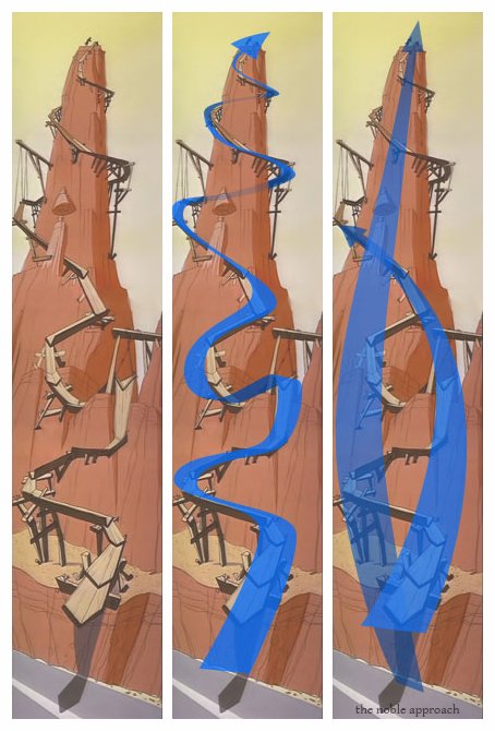
Pans 1: Lines of flow


To give the eye an easy path to follow, many pans will have one primary curving line of flow focusing on one main compositional element. A change in perspective will make the composition more dynamic.

The pan up this rock tower from Road Runner is a slow one... and Maurice is able to play a lot with the line of flow... having it cross back and forth across the screen as the camera moves north.


Many Pans will have both major and minor lines of flow. These all work to guide the eye, and add interest and texture to a pan.

Supplement to pg. 159 "The Noble Approach."

Monday, September 9, 2013

Cool and Warm Shadows

Maurice often combined cool shadows with warm light. (...as well as warm shadows with cool light.) He would push these contrasts depending on the needs of the story at hand. For example, a more dramatic moment, or a more satirical story would get a more "pushed" treatment. 

Above: Here are a few random examples from some of Maurice's film work showing how he combined light and shadow.

Supplement to pg. 100 of "The Noble Approach"

Monday, September 2, 2013

Simplifying Complex forms: Wrap and Overlap


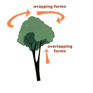
-Many times Maurice used simple geometric shapes when simplifying trees. Often he created added interest by using overlapping and wrapping forms. Frequently accentuating these forms by using slight up or down camera angles. 


From "Much Ado About Nutting" (1953)

In simplifying trees Maurice said; "Use a simple basic shape (circle, square, etc.) as a rough guide. Then add leaves, branches, to give your tree a more natural feel... always try to show the object you are designing from various angles: front, side, and back... remember there are three dimensions. Even in a highly stylized film, you want your elements to sit in space. Use overlapping forms and lines that describe the form to give a sense of dimension."

Supplement to pg. 97 of The Noble Approach

Thursday, August 29, 2013

Design Specifics 001

A pan from "Duck Dodgers in the 24½th Century." (1953)

More than any other designer at Warner Bros. Maurice tried to create environments that were unique to a character or story. Maurice could have simply designed "a planet"... but he didn't. Planet "X"' 's design functions more than just a backdrop. It supports and enhances the satire of the story. 

Supplement to Pg. 85 "The Noble Approach."

Wednesday, August 28, 2013

Book review from Cartoon Brew!

Amid Amidi at Cartoon Brew discusses "The Noble Approach." You can read his thoughts HERE!


A Personal Note:
In this review Amid discusses Robert J. McKinnon's biography of Maurice "Stepping Into the Picture: Cartoon Designer Maurice Noble." He calls the biography "a failure." I can't agree. To an animation fan expecting lots of art and technique I can see how the book might be disappointing. In fact McKinnon tried to fill the book with art, but was essentially frustrated by Warner Bros. This is a book about Maurice's life. To those of us that knew him it's a gem. I've read the book several times. and despite whatever faults it may have; it's the closest thing I have to the memories of sitting down with Maurice and listening to his stories. Stories that very well may have been lost to the ages without McKinnon's text. -tod

Monday, August 26, 2013

Book Review From Cartoon Research!

Chronicle books has sent out a few hard bound pre-view copies of "The Noble Approach" in the last week. Writer and animation historian Jerry Beck got his, and has made the first official review for the book. You can read it HERE.
Above: Maurice at work at MGM in the early 1960's. One of the images included in the review... and in "The Noble Approach."


Thursday, August 22, 2013

Steal Wool Progression


A Maurice progression from "Steal Wool." (1957)

(top) A rough layout - Used as reference by the animator.

(center) A color sketch... used as reference for the background painter.

... And the final background painted by artist Phil DeGuard referencing Maurice's final pencil layout, as well as the color sketch.


This background was then tested under camera with a simple character cel set-up. The resulting film frames were reviewed by Maurice to see if everything was working. If you look closely you can see the grease pencil line Maurice made through the above rejected test. He made changes to the set-up and re-shot it. Once everything looked ok... he proceeded to design and test the rest of the film.