Search This Blog

Wednesday, July 6, 2016

Looney Tunes love letters

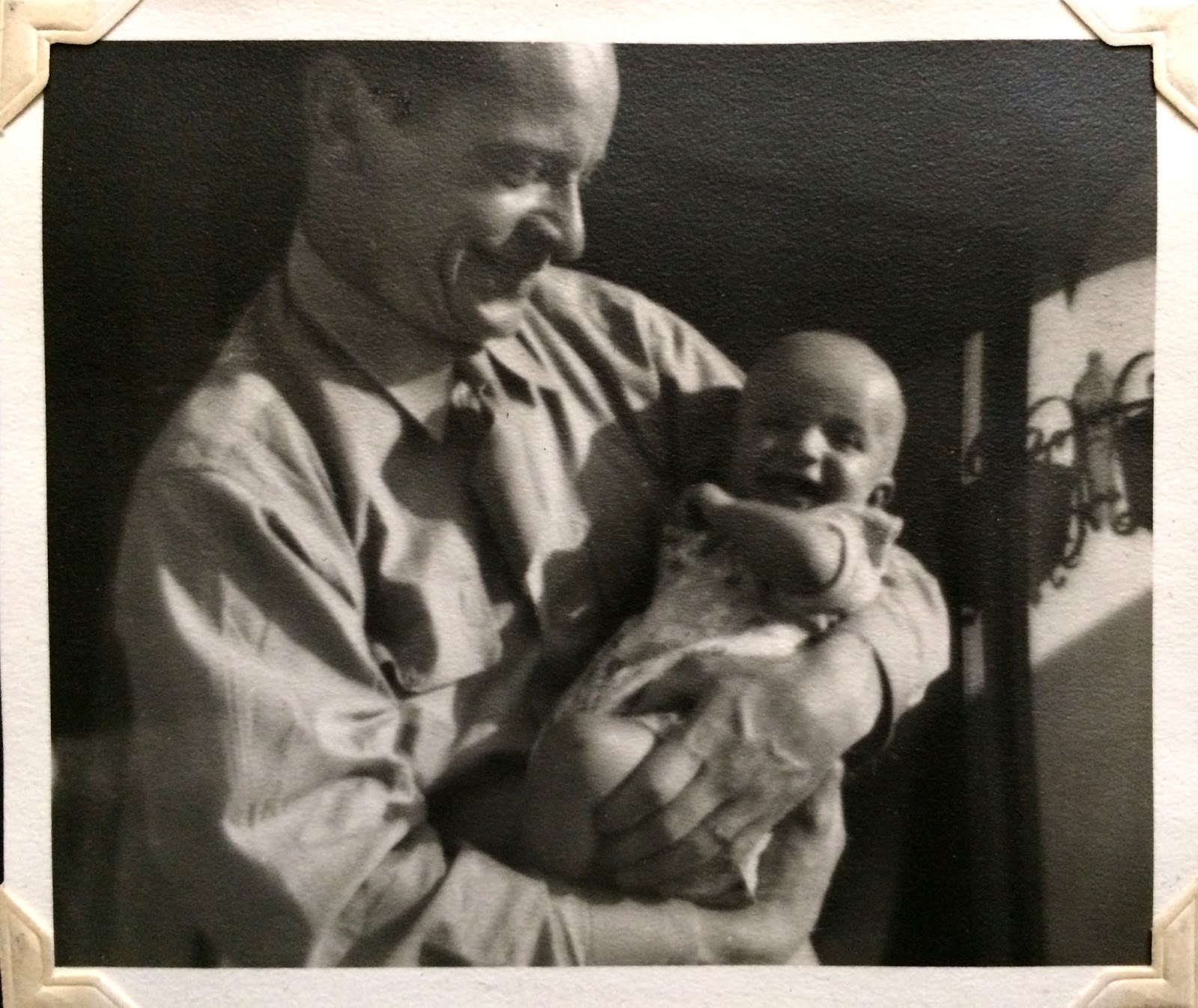
Maurice in 1944 with his oldest daughter Patty


Noble Motivation: Patty and Pam
While serving during WWII Maurice's wife left him, and took off with their two daughters. For years his only real connection with his children was through his cartoons at Warner Bros. He told me he KNEW his girls would see the cartoons... and he worked his tail off to make them special. Maurice often worked on the cartoons late, and over vacations and weekends. They were love letters to his children. His attempt at being a small part of their life somehow.

Addition to pg. 22 of "The Noble Approach."

Thursday, September 18, 2014

Thursday, April 24, 2014

Reference and Visual Memory 1


Maurice Noble had a unique way of using reference. Rather than drawing directly from source material for a particular design, Maurice would pull inspiration from what he called his "Visual Memory." This "Visual Memory" was a store of visual images in his brain that he had built over time through travel, viewing art, and other experiences that would make an impression on him.  Later... sometimes years or decades later... he would redraw his impression of a place from memory for a design... using its strongest characteristics. 

Here are a few Maurice design examples, and their original inspiration:
"Claws For Alarm" and Mark Twain.

It is well known that Chuck Jones was a huge fan of American author Mark Twain. What is less known is that Mr. Twain found his way into a number of Chuck's cartoons. Here Maurice gives us a "poor man's" version of the grand hall from Twain's 19 room Connecticut mansion in "Claws For Alarm." (1954) 


"Deduce You Say" and the Tam O'Shanter.

Maurice often drew design inspiration from life experience. His assignment for "Deduce You Say" (1956) was designing old world London. But since he had never been to Europe, he referenced the second best thing... The Tam O'Shanter restaurant on Los Feliz Blvd. Pictured here is Walt Disney's favorite table.


Inspiration from "Lost Horizon." (1937)

Frank Capra's movie "Lost Horizon" was one of Maurice's favorites. From it he drew inspiration for bits of "How The Grinch Stole Christmas," "What's Opera, Doc?" and many other films. This is a great example of Maurice's use of visual memory. He couldn't look at still frames of the movie, but he had seen "Lost Horizon" enough times that certain scenes made a distinct impression on him. Finding their way into his work.


Supplement to pg. 77 of The Noble Approach: Maurice Noble and the Zen of Animation Design.

Thursday, January 30, 2014

Rockwell Kent and the Denison Museum Collection


Above: Khari Saffo ’15 with “The Noble Approach” and Rockwell Kent’s “Twilight of Man.”

The folks at Denison Museum of Granville OH were a huge help in putting "The Noble Approach" together. They kindly allowed me to include Rockwell Kent prints from their collection in the book. Khari Saffo of Denison has written a lovely article about the experience which can be found HERE! Originally I had intended on including more Kent images, but unfortunately because of space issues I was only able to include one.

Rockwell Kent was one of the most famous American print-makers of the early 20th century. Kent's use of light and dark pattern, and the way he stacked values had a huge influence on a young Maurice. Years later, while training at Chuck Jones Film Productions, Maurice taught us that... "good use of light and dark is the first important step in learning to use color." He cited Rockwell Kent as a great example of how to use value. 


Many have asked... "What exactly does stacking value mean?" In simple terms, it describes the method of putting an element in a picture against something darker or lighter than itself so that it "reads" easily. In these Kent examples, every single element in his picture can be seen clearly in spite of using a limited value range.


To see more... please check out page 91 of The Noble Approach.

Images courtesy of Denison Museum.


Tuesday, January 14, 2014

Maurice and the McKean Hospital & Leper Colony Chiang Mai


Above: A quick tour of The McKean Hospital via scooter.

Chiang Mai was always a special place to Maurice. In 1908, Maurice's uncle, missionary Dr. James McKean, and Pauliang (Guardian Father) Chantah Indravude set up a leper colony after asking the King of Thailand for a parcel of land. The McKean Hospital still exists there today. Gifts from Dr. McKean, such as Thai and Indonesian batiks, made a huge impression on young Maurice, who in turn created his own batiks at home. For the rest of his life he would foster a love of Asian arts and crafts. Maurice's uncle had such a strong influence that for a time Maurice considered becoming a missionary. In later life Maurice had serious plans to build an animation studio in Thailand. Our first project was to be "The Pumpkin of Nyefar," but Maurice passed on before we could start production. 


The Noble Approach first five day workshop 2012
To see a list of artists that attended, please visit HERE

Originally "The Noble Approach" was to be published in the spring of 2012. To celebrate we arranged a five day workshop in Chiang Mai based on a few of Maurice's basic teachings. Because of circumstances beyond our control the book wasn't published until late 2013. Now that the book is out we are planning more "Noble Approach" workshops in the very near future.


Thursday, January 9, 2014

Surogat


Maurice never gave much praise to many non-Disney, non-Warner's cartoons. But one of his favorites was the 1961 Oscar winner "Surogat" by Dusan Vukotic. Maurice felt that the film was a great example of what the animated medium is best at; "graphic imagination."  It's not too far of a stretch to see how this film could have helped influence Maurice's own Oscar winning effort, "The Dot and the Line." (1965)

Tuesday, December 24, 2013

How The Grinch Stole Christmas: A Christmas Classic

In 1966 M.G.M. released what would become a Christmas classic, "How The Grinch Stole Christmas." The TV special was directed by Chuck Jones, based on the book of the same name by Dr. Seuss (Ted Geisel.) Maurice art directed the short, taking inspiration from Seuss's book illustrations, adding to them his own Noble twist.

Above: Maurice rough location design pencils (left), with marker color studies for "The Grinch."

On the Looney Tune's shorts of  the 1950's Maurice had painted numerous design keys in cel vinyl for the background painter to follow. Many of these keys were in essence small versions of the final backgrounds. By the 1960's Maurice began making small marker sketches directly over his rough pencils. Magic Markers weren't in common use until the late 1950's and they were simply faster than paint. The more staging ideas Maurice could get through... the stronger his final compositions would be.

Above: Maurice "Grinch" story and concept sketches.

Maurice's duties went far beyond simply designing the films he worked on. Early in the film making process he would often give numerous staging, story, and gag ideas. Most of these ideas didn't make it into the final film, but many did, and the influence he had on the staging and feel of "The Grinch" is undeniable. The back and forth story process that Maurice and Chuck Jones used is described on Pg. 56 of "The Noble Approach."

"The Grinch" was one of Maurice's favorite films from the period. But for many years Ted Geisel never expressed how he felt about the film. In 1991, during Geisel's memorial service, Geisel's doctor relayed the following message to Maurice: "Ted wanted mee to tell you how much he loved Grinch, especially your work on it." Amused, Maurice later told me, "This was typical of Ted, always getting in the last word."


Monday, December 9, 2013

The Noble Approach California Mini-Book tour

With the talented Brooke Keesling at Cartoon Network.

 Things have been a bit quiet here on the blog as we have been traveling throughout California with "The Noble Approach." We gave various Maurice talks, and book signings throughout the region. Everywhere we went we were met with great questions and great enthusiasm! It was fantastic seeing old friends, and meeting new ones. A number of the Noble Boys joined our discussions, and a good time was had by all. A huge thanks to Disney Features, Disney TV, Cartoon Network, Pixar and CTN 13 for hosting us! A special thanks to Chronicle Books for believing in this project, and helping make it a reality!

 With Disney Vet and designer Cynthia Ignacio Gordon
 With the happy story man Julius Aguimatang who loves to goose people when he's happy.
 At the famous Lucky 7 pub with Andrew Gordan, Sirid Garff, and Scott Clark
 In the Pixar lobby, the closest I've been to having an Oscar in years
 At one of the Noble talks. You can see the excitement mounting. 
A complimentary shirt from the lovely ladies of The Cartoon Saloon!

Friday, November 29, 2013

Mike Giaimo on Maurice Noble

Art director Mike Giaimo (Frozen, Pocahontas) was one of my early design instructors at Cal/Arts. Though I had enjoyed Maurice's work for many years on TV, I had no idea who the man was. It was Mike who first introduced my class to the wonders of Maurice, and many of Maurice's ideas. 

Mike first met Maurice on March 12, 1974 at the Brand Library in Glendale, CA. At the library Maurice went through his work history, showed a few of his films, then discussed his thoughts about design in the Q and A session. In many ways his talk was basically a condensed draft of what would become The Noble Approach The chat made a huge impression on a young Mike; who recently said of the event, "I can remember it like it was yesterday. Maurice had the small gallery filled with easels on which he displayed bg's, layouts, etc. I distinctly remember a very long pan bg of the planets X, Y, and Z from DUCK DODGERS, as well as some practice watercolor bg's he'd done on SNOW WHITE."


Several years ago, Mike generously shared his feelings about Maurice and his art for "The Noble Approach." Unfortunately because of space issues I was only able to include a small portion of his essay in the book. (pg 47) I am pleased to present the text here in it's entirety.  


THOUGHTS ON A VERY NOBLE STYLE:


"What is the “Noble Style”? What makes Maurice’s work so distinctive, unique and appealing? The key to understanding his work lies in the world of opposites: his touch is light and easy, yet sure handed. It is fanciful and whimsical on the one hand, dramatic and bold on the other. It is decorative without being fussy, and solid without being overbearing. . It is never strained or overwrought.
In his work there are both masculine and feminine traits-a perfect design synthesis of yin and yang.


Maurice was a true modernist, and it’s no surprise that his work came into full flower during the mid 20th Century where a refined, minimalist aesthetic prevailed in architecture, painting, advertising, and applied arts. Maurice’s design sense folded nicely into this movement, and like all great modernists, his work remains fresh and contemporary today.


Above: A background set-up from Boyhood Daze (1957) Courtesy of Mike Giaimo.

It is hard to imagine a Witch Hazel cartoon without his subversive visual wit, where staircases, tables, sofas and curtains seem to defy gravity, and multi- point perspectives abound. Under Maurice’s deft touch, Witch Hazel’s quirky world seems right and reasonable.
In DUCK DODGERS, could anyone but Maurice have transported us so dramatically (and humorously) to the 21st ½ Century with such a keen sense of cinematic scale and endless technological invention?
In the Ralph Phillips short BOYHOOD DAZE, Maurice proves his versatility segueing from the darkest depths of the jungle to the wide open reaches of space to the dank confines of a prison cell with ease. Indeed, the visual locales of the Ralphs Phillips shorts are stunning not because we see them as identifiable places, but because they are flights of Ralphs’ (and Maurice’s) vivid imagination.


As director John Ford found his visual muse in Monument Valley, Maurice found his particular brand of cinema language through the ROADRUNNER series, where his sense of staging and camera perspective came into full play. One senses in this series that not only is Maurice a master with camera direction and design, he’s having a heck of a good time as well.
It is interesting to follow the evolution of Maurice’s style thru the ROAD RUNNER cartoons. In the earlier entries of this series the desert landscapes are caricatured, but they pale by comparison to the more surreal and whimsical heights he would achieve with these environments by the mid-fifties. The visuals would evolve to reflect more and more the precarious relationship between the Coyote and Roadrunner, with huge boulders that rest unsettlingly upon the top of pin-point buttes, desert plant life that looks more like spiky specimens from another planet, and strange cloud formations that anticipate and punctuate the Coyote’s eventual demise.


Maurice’s ethos at Warner Bros. hit a high water mark in 1957 with WHAT’S OPERA DOC? Here his skills in layout, design and color came to its fullest fruition. Visual invention seems to burst from every frame. With grand, cinematic scale, expressionistic fauvist-like color, and decorative detailing, this is truly Maurice’s’ magnum opus. What’s truly surprising in WHAT’S OPERA? is how we are transported to a realm far beyond the common Looney Tunes world. Visually WHAT”S OPERA? seems to bridge the gap between fine and commercial art. It is a masterful piece of work with Maurice firing on all cylinders. Indeed, looking at Maurice’s output during his Warner years one could say that if it weren’t for his sly graphic wit, there would never have been a distinctive stand out style at Warner Bros. Without his touch, the Looney Tunes are polished and serviceable but visually unremarkable.


Perhaps Maurice’s most sublime effort was his styling for THE DOT AND THE LINE. The abstraction of the lead characters (literally a dot and a line) called for a non-representational approach to the production styling. This is Noble styling at its minimalist best; a modernist tone poem where line and shape and color are exploited to their fullest. Abstract, angular shapes visually support the rigid line character, while the frivolous dot is enhanced by graceful and decorative curves. Bold color blocks give mood and atmosphere, and though the shapes are simple, the world Maurice creates for THE DOT AND THE LINE is rich and full.


In the1966 television special HOW THE GRINCH STOLE CHRISTMAS, Maurice’s styling proved to be a beautiful compliment to the very popular Dr. Seuss book and illustrations. Maurice achieved a distinctive, whimsical look in GRINCH without treading upon the familiar Seuss style. Indeed, watching the film and then referring back to the book’s illustrations one feels that Maurice managed to further resolve and define the look of Whoville and its environs with his graceful use of curves, dramatic camera angles, and Noble “decorative touches” which are found on everything from snow capped peaks to garlands, bows, and stocking wire.


Smart cinema language and a confident use of line, shape and color all contribute greatly to the Noble style, but perhaps the most defining (and less tangible) key to understanding Maurice’s sensibilities lies at the inner core of the man himself-his integrity.
Though we see on the surface of Maurice’s work charm, sophistication and playfulness, there is an underlying sincerity and truthfulness that holds all the design elements together. This is why his work is so honest and engaging. With Maurice there is never a visual false note or misstep.


What is the noble style? It is artistic authenticity , which is timeless."


m. giaimo

Jan. 2011

all text © tod polson and Mike Giaimo

Tuesday, November 12, 2013

Maurice Noble and the Art of the Pan: Rhythm -On the Chronicle Books Blog

This week Chronicle Books features a few concepts from the Noble Approach on their blog. In the post I expand on some of Maurice's ideas about the rhythm of pans that I lightly touched on in the book. (see pgs. 159-160 of the Noble Approach for reference.) 

Above: An example image about spacing from the article. Please go to the blog HERE to read more.

As with many of the other ideas introduced in Maurice's text I was only able to cover a few basic Noble concepts in 175 pages. I will expand on Maurice's thoughts about pans, and other subjects in future posts.

Supplement to pg. 160 of The Noble Approach.

Monday, November 11, 2013

Simple Color Themes

Maurice often used simple color themes when designing his films. Many times he would carry variations of a single theme throughout an entire film. For each sequence he would often make one or another color from a color chord the dominant color. For example the blue accent of an earlier sequence may become the dominant color of a later sequence. In some of these examples Maurice has mixed things up with a yellow accent.

A rectangular color chord from "Much Ado About Nutting." (1953)

Supplement to pg. 104 of The Noble Approach.

Monday, November 4, 2013

AWN reviews "The Noble Approach."

Fred Patten of "The Animation World Network" gives a lovely review of The Noble Approach.

To read the article please go HERE.

Musician Billy "Keys" Benson enjoying his copy of "The Noble Approach" with friends in Northern California.

Tuesday, October 29, 2013

Color Keys and Color Sketches: Background Drop-off


A Maurice color key sketch (top) with a Phil DeGuard background from "Boyhood Daze." (1957) courtesy of Paul Bussolini

Phil's final backgrounds (as in the above example) were often painted lighter and with less contrast than Maurice's color keys. The reason being that under camera each background carried an average of 5 cel layers on top of it. Each cel layer would darken the background a certain percentage. 

 A background and cel set-up from "Boyhood Daze." (1957) courtesy of Mike Giaimo. 

It is easy to see the striking difference in value and contrast between a "naked" background, and one shrouded in its cel covering. Maurice would test background/ cel setups under camera to make sure all the elements looked correct BEFORE committing to a specific design approach. A pretty background painting meant little if it didn't work under the lens. Only once key shots worked to Maurice's satisfaction would Phil would move forward with the backgrounds on the rest of the film.

Supplement to pg. 146 of The Noble Approach


Saturday, October 26, 2013

Disney Books Review


Disney Books makes a review of The Noble Approach, and likes it! Read the complete review HERE.

Photo credit- Sean Dicken
Taken at Oscar's Books, Canada

Thursday, October 24, 2013

Pointers: Literal and Implied Guide Lines

Maurice often used different compositional tools to help guide the focus of the audience to a specific part of a picture plane. Most usually he would try to use background elements to support, and draw attention to a character. 


Here are a few examples of literal and implied guide lines. Literal lines (hi-lighted by solid arrows in these examples) are actual lines that point to a certain area of focus. Implied lines (here illustrated by dashed arrows) are created by elements that line up in the picture plane. The relationship between these elements help create a pointing device that support the position of the character. I've chosen examples where the Coyote is rather small. Movement of the character is key to attracting the eye. But without pointing devices, it would be easy for the character to get lost.


Implied lines are related to Gestalt reification and illusory contours. The basic idea being that the mind perceives an edge or line simply because of the placement and space relationships between objects.

Supplement to pg. 151 of The Noble Approach.


Monday, October 21, 2013

Maurice Pans 005: Beginnings and Endings

A vertical pan from "Much Ado About Nutting." (1953)

Maurice taught, "The eye isn't going to see much detail in the middle of a fast pan. It will see color and pattern in an abstract way. Focus on making the start and finish of the pan work well, the parts that the audience will actually see. Then concentrate on the length and feel of the pan."

From pg 159 of "The Noble Approach."

Tuesday, October 15, 2013

The Thunderbolt - As Retold By Eric Calande

Images: A great deal of the design for "Horton Hears a Who" (1970) was inspired by trips Maurice took to Hawaii. Posted here are some of Maurice's "designed storyboards" for the film.

Apparently while Maurice was at Disney's in the 1930's, he managed a short vacation to see his brother who was attending The University of Hawaii. Aviation was in its infancy and the only practical way to make the trip was by cruise ship. The trip itself took several days and as the ship neared the island Maurice needed to notify his brother of his impending arrival. Maurice went to the on-board telegraph office and began dictating his massage; "I've had the most amazing time on-board the ship. What an amazing experience this has been. The staff has been just incredible and I've meet the most wonderful people. My accommodations have far exceeded my expectations. I could talk about the delicious food for days. I've never eaten so well." etc. etc. Once Maurice finished dictating his message the operator told him his long-winded message was going to cost about $75 to send. So Maurice shortened the message to... "Arriving on next ship - Maurice". 


Upon arrival Maurice was greeted by his brother and while de-boarding the ship, he saw the most lovely native girl. Maurice was awestruck by her beauty. Apparently his eyes met hers, hers his, and in Hawaiian terms, both were "struck by the thunderbolt" (love at first sight). 


The two ended up meeting and spending a lot of their time together. Though the natives were SURE Maurice was going to steal the heart of, and marry one their women, Maurice's vacation came to an end and he returned to the mainland. 

Over time Maurice lost contact with the girl, and years later returned to Hawaii to look for her. Through the locals he learned that the girl's family owned one of the biggest department store chains on the island. Figuring a wealthy, beautiful woman wouldn't want anything to do with a lowly animation artist, he sadly abandoned his quest. For the rest of his life Maurice talked about his regret in not staying and marrying the girl. 

...And that concludes the story of the Thunderbolt. - Eric Calande

Artwork courtesy of Paul Bussolini

Supplement to pg. 70 of The Noble Approach. 

Friday, October 11, 2013

Martian Through Georgia Progression

Above: A Maurice Noble layout and final Phil DeGuard painting from "Martian Through Georgia." (1962) The film was co-directed by Chuck Jones and Maurice.

In his early Warner career, Maurice made numerous color keys to help guide painter Phil DeGuard in the final background paintings. But by 1962 the two artists had been working together so long that Maurice could often give Phil simple shorthand color notes, such as in this background layout, to indicated what he wanted. 

Lettering by Don Foster.

Supplement to Pg. 126 of "The Noble Approach." 

To watch the film, visit the link HERE.

Monday, October 7, 2013

Color and Value: 001

Maurice most usually thought of color in how it related to value. ( The relative lightness or darkness of a color.) Always making sure that a composition worked in black and white FIRST before moving on into something more colorful. 

Cartoon Colour cel vinyl was Maurice's paint of choice. The paints were marked with a one (1) for the lightest value, and the bigger the number, the darker the paint. 


Above is a chart Maurice used to show how the value of many colors he used related to gray. 

GRAY SCALE SHOWING CORRESPONDING COLOR VALUES
The color number appears vertically under each color and #20 represents the darkest value. The gray values on the left are in the same order, from dark to light, and any color number appearing on a horizontal line with a gray value has that same gray value when photographed in black and white. 

How is this useful? It's sometimes difficult to tell how dark or light a color really is. When transferring a black and white sketch Maurice wanted to be sure that his colors were as close as possible to the original sketch values.

Supplement to pg. 91 of "The Noble Approach."

Clean up by Esben Sloth

Thursday, October 3, 2013

Tools of the Trade

Details of a few of the simple tools Maurice used to create his art. Maurice never threw anything away, and some of these pencils go all the way back to the beginning of his career; helping create some of his greatest work. 

It is well known that Maurice wasn't a fan of the computer. He often argued that the best way to learn to control color and value was to learn to draw and paint with traditional media... THEN later perhaps apply this knowledge to the computer. 


Supplement to Pg. 125 of "The Noble Approach."

Photo © 2013 Tod Polson