Search This Blog

Friday, September 27, 2013

Maurice Pans 04: Implied line of flow

Example from: "Nelly's Folly" (1961) Courtesy of Animation Sensations Art Gallery

Instead of having one clear element guiding the eye through a pan, Maurice would often create a line of flow by creating relationships between a number of smaller compositional elements.

Example from "Drafty Isn't It?" 

Then Maurice would support this line of flow with other smaller elements that were roughly parallel to the main line of flow.

Supplement to Pg. 159 of "The Noble Approach." 

CTN Expo 2013

Animation expo
November 15th- 17th 2013

We've been invited to this years CTN Expo to have a chat about Maurice and "The Noble Approach." We'll look at Maurice's design process, and discuss a number of interesting things that didn't make it into the book. A book signing will follow the conversation.

To learn more visit:
http://creativetalentnetwork.com

Tuesday, September 24, 2013

Maurice Pans 03

Example from "90 Day Wondering." (1956)

To make a pan more dynamic, Maurice would often use background elements to lead the eye to and from camera. The lines of these elements also often acted as the line of flow.

Supplement to pg. 159 of "The Noble Approach"

Download the entire cartoon HERE.

Wednesday, September 18, 2013

Maurice Pans 02: Spacing and Leaning Elements

From "90 Day Wondering." (1956)

One method Maurice used to help keep pans from strobing was leaning elements to cut across the picture plane. The faster the pan, the more he would lean the elements. Then, unless the story called for it, he would also make sure to make the spacing of those elements uneven. 


Supplement to Pg. 160 of The Noble Approach.

Monday, September 16, 2013

The Noble Approach Splogged! Part 1

Michael Sporn begins his review of "The Noble Approach." A more in-depth write up from him to come. Read his blurb HERE.

Mr. Sporn also begins his own look at Maurice's Career starting at Disney Studio. You can read his thoughts HERE.


Maurice had tried to get across a more graphic approach to design several times while working at the Disney Studios. He told me that he had tried "something graphic and daring" with the forest fire sequence in Bambi. But the powers in charge always went with his more realistic approaches. However on Dumbo, Maurice had a chance to play graphically... and the results are what we now know as the infamous Pink Elephant Sequence.

Images borrowed from Michael's blog. To read and see more about PINK ELEPHANTS click HERE!

Thursday, September 12, 2013

Pans 1: Lines of flow


To give the eye an easy path to follow, many pans will have one primary curving line of flow focusing on one main compositional element. A change in perspective will make the composition more dynamic.

The pan up this rock tower from Road Runner is a slow one... and Maurice is able to play a lot with the line of flow... having it cross back and forth across the screen as the camera moves north.


Many Pans will have both major and minor lines of flow. These all work to guide the eye, and add interest and texture to a pan.

Supplement to pg. 159 "The Noble Approach."

Monday, September 9, 2013

Cool and Warm Shadows

Maurice often combined cool shadows with warm light. (...as well as warm shadows with cool light.) He would push these contrasts depending on the needs of the story at hand. For example, a more dramatic moment, or a more satirical story would get a more "pushed" treatment. 

Above: Here are a few random examples from some of Maurice's film work showing how he combined light and shadow.

Supplement to pg. 100 of "The Noble Approach"

Thursday, September 5, 2013

Duck! Rabbit, Duck! layout comparison


Layouts and final film images from "Duck! Rabbit, Duck!" (1953)  

-Maurice made a handful of color sketches (shown on pg. 136 of "The Noble Approach") for "Duck! Rabbit, Duck!" then drew very specific background layouts to guide painter Phil DeGuard

Supplement to pg. 136 of "The Noble Approach."

Monday, September 2, 2013

Simplifying Complex forms: Wrap and Overlap


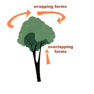
-Many times Maurice used simple geometric shapes when simplifying trees. Often he created added interest by using overlapping and wrapping forms. Frequently accentuating these forms by using slight up or down camera angles. 


From "Much Ado About Nutting" (1953)

In simplifying trees Maurice said; "Use a simple basic shape (circle, square, etc.) as a rough guide. Then add leaves, branches, to give your tree a more natural feel... always try to show the object you are designing from various angles: front, side, and back... remember there are three dimensions. Even in a highly stylized film, you want your elements to sit in space. Use overlapping forms and lines that describe the form to give a sense of dimension."

Supplement to pg. 97 of The Noble Approach